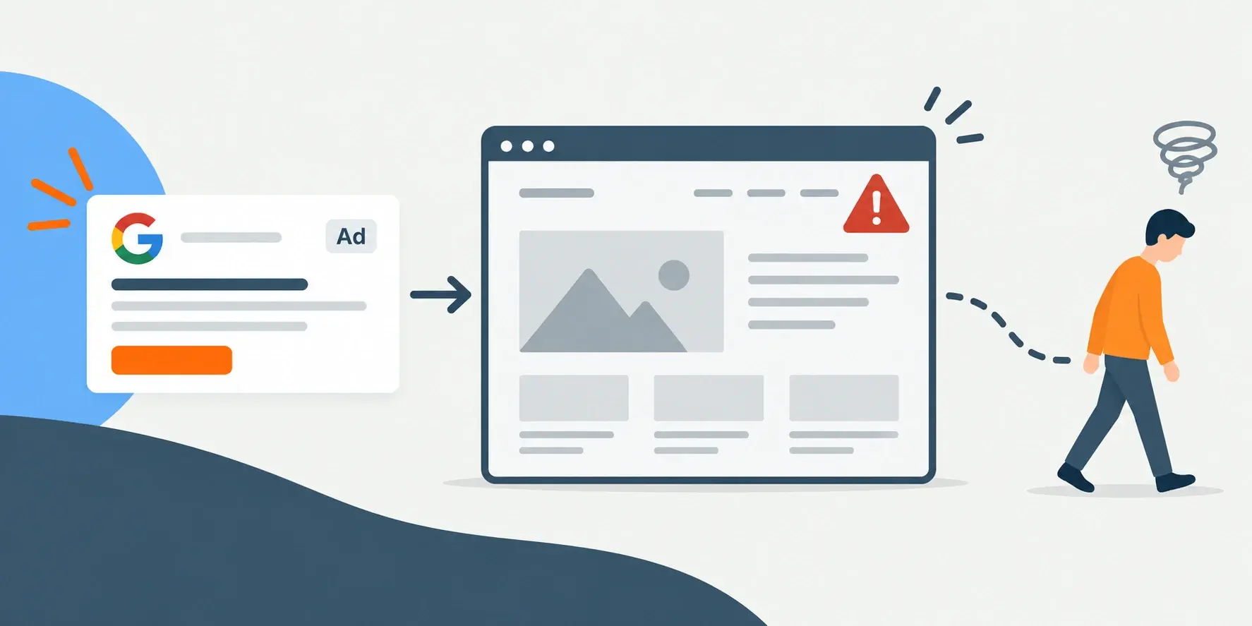
Think about the last time you clicked an ad and landed on a website that immediately made you question the company behind it. Maybe the site looked outdated, the navigation was confusing, or the page didn’t deliver what the ad promised. You probably didn’t stick around long.
The ad may earn the click, but the website has to earn the customer. If the experience after the click creates confusion or doubt, even a well-targeted advertising campaign can struggle to produce leads or sales.
Every paid click represents an investment. When visitors arrive on a slow, confusing or unconvincing website, that investment disappears without producing a meaningful action. The problem may look like poor advertising performance, but changing audiences, keywords or ad creative won’t fix an experience that breaks down after the click.
Build Your Credibility
Ancient Greek philosopher Aristotle coined the three pillars of persuasion: logos (logic), pathos (emotion) and ethos (credibility), aka the three pillars. Granted, Aristotle never had to convince someone not to hit the back button because his website took six seconds to load, but the principle still applies. A strong website is a great opportunity to build ethos, or credibility, with your audience.
Before someone fills out a form, calls your business or makes a purchase, they have to believe they’re in the right place. Your website helps answer the questions running through their mind: Does this company understand my problem? Can it deliver what it promises? Does it look credible? What should I do next?
While there’s no single “right” way to establish credibility, several best practices are worth keeping in mind.
Make A Strong First Impression
People form an impression of your business within seconds of arriving on your website. If the page looks outdated, cluttered or disconnected from the ad they clicked, they may leave before reading enough to understand what you offer.
Strong website visuals are not there simply to make the page look attractive. Photography, video, icons and other design elements should help visitors understand the offer, see the value and know where to go next. The goal is to reduce uncertainty, not fill space.
For example, a service business might use project photography, customer testimonials and a clear explanation of its process to demonstrate experience. A product-based business may need detailed product images, comparison information and proof that purchasing from the company is safe and straightforward.
According to an article by Forbes Communication Council, your website’s credibility in terms of design can be determined by the “Four-Second Test.” The test is simple, open any webpage and set a timer for four seconds. If you can’t explain what the page is about, then it failed.
Visual Elements
Humans by nature rely on their eyes to process the information around them. Words can only mean so much if there is no visual to accompany them. Incorporating visual elements can make your message stronger, easier to understand and feel more “finished.”
Visual elements can include:
- Photographs
- Infographics
- Icons
- Artwork
- Video Media
If your website sells computer hardware, for example, you should have images of each product being sold, and icons to help you navigate the site. Elements like infographics and videos can also help you compare different functions or better understand the products.
Colors
Websites are a great tool to express your organization’s creativity, and the usage of color is a powerful way to enhance that.
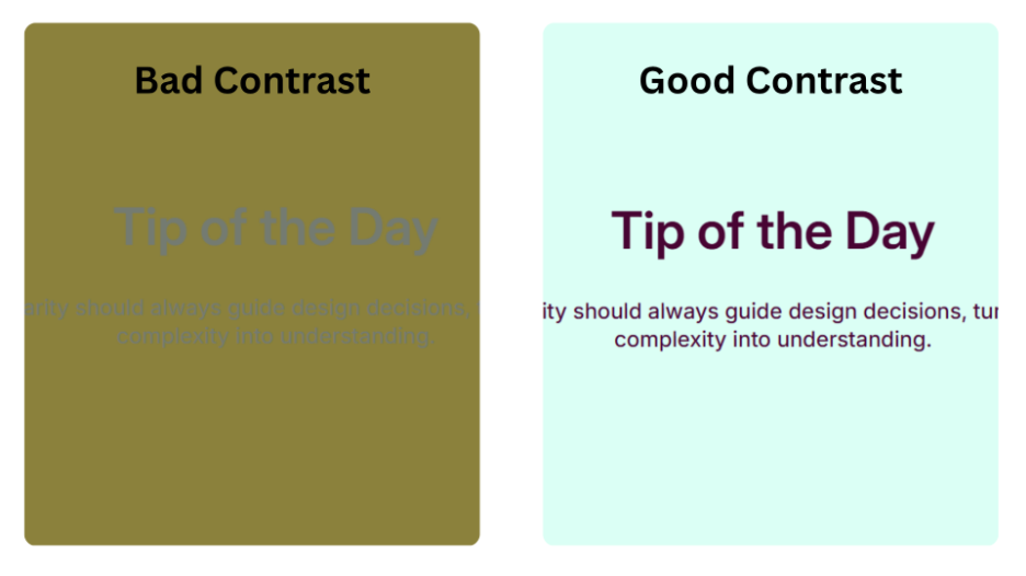
When it comes to color, make sure the background color doesn’t clash with the text color. It seems like an obvious thing to say, but when we strain to read something, we are less likely to fully comprehend the text. Using contrasting colors can also improve accessibility. Having high contrast between text and background colors can improve accessibility, as visually impaired individuals may have a hard time reading low-contrast text.
A great free resource for testing color schemes and accessibility is coolors.co. You can enter hex codes for different elements, like text and backgrounds, to check contrast or generate color palettes.
Here is an example of both good and bad contrast:
Branding Consistency
Your ads and website should feel like they came from the same company. Consistent colors, typography, imagery and messaging reassure visitors that they reached the right destination.
That consistency matters beyond appearance. If an ad promotes a specific service, benefit or offer, the landing page should reinforce it immediately. When the promise in the ad does not match what visitors find on the website, confidence drops and people are more likely to leave.
For example, apple.com has one of the strongest visual identities, staying consistent yet fresh over the years. Apple uses metallic, cool tones to create its visual identity through color. They utilize textures like glass and metal to create a sense of futurism and luxury for their brand. Their use of rounded-square shapes in their website elements mimics the design language of their products, which have a similar shape. You can see this branding consistency throughout their website.
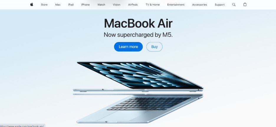
Inconsistent branding can look like mismatched colors, different fonts or inconsistent backgrounds on product images. For example, with a brand like Apple, it might feel off-putting to see a product photo with a bright geometric background, or sharp corners on text boxes because those elements don’t align with their established visual brand identity.
A branding kit can help you stay consistent with fonts, imagery, assets and more, making your website feel more polished and credible. If you don’t have one, note your brand’s assets by writing down color hex codes, fonts, shapes, templates and other assets.
Website Navigation
Having an easy-to-navigate website can strengthen your advertising efforts and boost credibility. When pages and menus are clearly organized, your audience can quickly find the right information, making them more willing to interact with your site. For example, if your contact page is buried behind another menu, viewers will be less motivated to spend time seeking it out and even less motivated to contact you.
Proper navigation and layouts keep your viewers on the site and make them less likely to leave for a competing site.
Search Engine Optimization for Your Website
Search Engine Optimization (SEO) helps your website appear at the top of search results. Optimizing your site’s SEO can attract more relevant viewers to your content, making your advertising even more successful.
Benefits of SEO optimization include:
- Increased organic traffic
- High-quality/Targeted visitors
- Less reliance on paid ads
- Greater visibility
- More credibility
- Supports paid search advertising
Professional SEO tools like Semrush, Screaming Frog and Google Search Console can provide a list of SEO issues to fix on your website, analytics features and website settings to improve your SEO performance.
Fixing What Matters
Implementing all these changes and processes may seem daunting, but it is important to take it one step at a time. Start by diagnosing any large, crucial issues that are common deterrents for your audience, then develop an improvement strategy and finally publish any edits to your website.
Usually, one small fix can yield substantial improvement in your website’s advertising performance, but it is important to keep all the best practices in mind. Sometimes you don’t need someone to start from scratch. You just need someone who can help you get across the finish line.
Your digital advertising can only work as hard as the website behind it. If your website is holding back your marketing efforts, let’s talk about how TKG can help turn it into a stronger tool for growth.